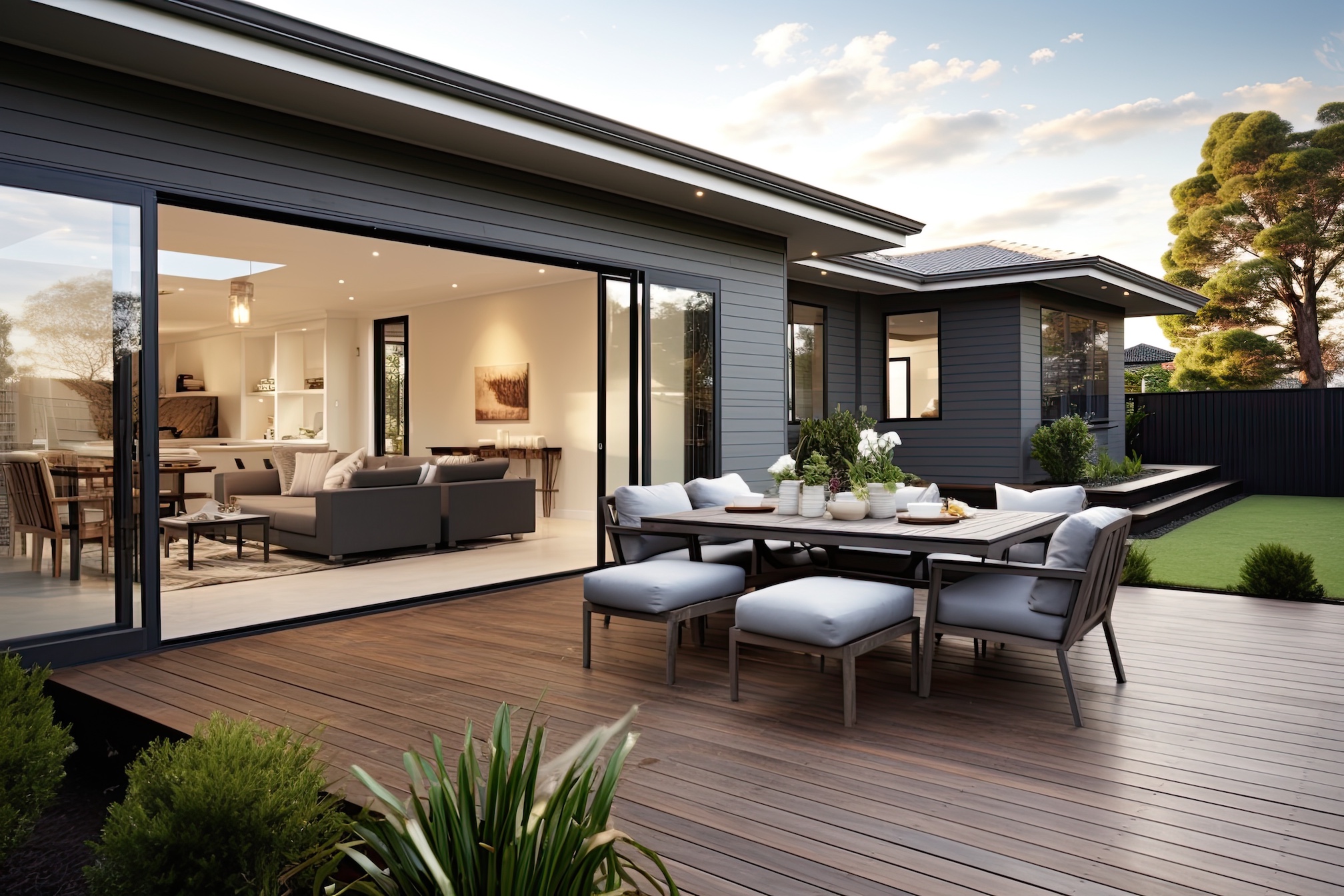
With the kitchen being the heart of the home and all that, your choice of colour scheme has never been more important. What’s more, there’s never been so much variety to choose from. Price Kitchens have been designing and manufacturing stunning designer kitchens for over 30 years. Their extensive range of classic and contemporary kitchen designs is just one example of the vast choice of colour schemes available in the market place today.
Of course, all colours look gorgeous in the showroom but which one should you choose for your kitchen at home? This is where it gets interesting. Colours affect us in many ways. Without delving too much into the ins and outs of colour psychology, we can surely all agree that different colours can have a strong influence on our mental and physical state of mind.
Let’s take a closer look at the different colours and what they might say about you and your kitchen.
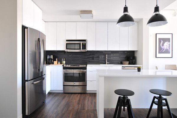
Whites and brights
A bright, light filled colour scheme creates a cheerful environment that everyone wants to spend time in, particularly when the weather outside is anything but fun and friendly. A bright and welcoming kitchen scheme can be a happy focal point for all the family, and friends too, to congregate and socialise.
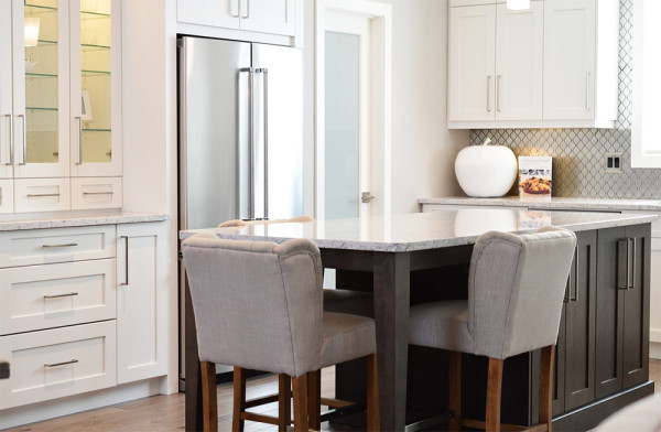
White kitchens, including an increasingly popular range of creams, off-whites and neutral schemes, are probably the most versatile choice for the home. White is an excellent solution for traditional and contemporary kitchen design schemes, is infinitely adaptable to personal tastes and always adds a sense of sophistication. It can also act as an excellent accenting colour for bolder colour combinations.
White is associated with cleanliness – which is always a good thing in the kitchen.
Black and grey
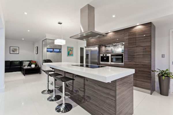
A black or dark grey colour scheme can be very difficult to pull off. Get is wrong and you’ll be left with a dark and depressing space that is not beneficial to anyone’s wellbeing, even with the addition of copious lighting. But get it right and you have a sleek and stylish kitchen that oozes elegance, power and a little bit of decadence, particularly in a contemporary kitchen setting.
Black can be an aggressive combination with other colours, particularly red and orange. Better to team black with white, neutrals or browns.
Red
Red is a symbol of love and passion, power and danger. It is the colour of fire and of blood – a stronger colour is hard to imagine. Seeing red (literally!) is scientifically proven to raise your blood pressure and your heart rate. You would certainly expect the owner of a red kitchen to be a forthright, confident individual, not a wall flower.
From Crimson to Ruby Red, red kitchens make a real statement and can look fantastic if allowed to take centre stage. Otherwise, this colour can appear overly fierce and may need to be offset by something more soothing such as a shade of white.
Orange
A loud and proud colour, orange symbolises enthusiasm and creativity, laughter and celebration. It is one of the most vibrant shades on the colour wheel and a wonderfully stimulating colour that increases oxygen levels to our brains and gives the impression of heat.
If you want your kitchen to be a calm and relaxing place, this may not be the colour for you, unless you use muted shades of Peach or Terracotta, or use bright orange as an accent colour alongside soft, pale hues.
Yellow
The colour yellow represents fresh energy and joy, and taken to its bright Lemon or Lime Yellow extremes can be very hard to work with. It’s probably the worst colour to combine well with white in any interior design scheme – better to team with darker colours such as dark green, brown or even grey.
Yellow is said to increase mental focus and pretty yellow kitchens in Warm Amber and Saffron or Pale Flax and Buttermilk shades can add a clean, refreshing and welcoming vibe to your home.
Green
Green is the colour of Mother Nature and the least taxing on the human eye. It suggests harmony and balance which can make for a relaxing cooking experience in the kitchen. From Sage to Teal, Apple to Moss, green works exceedingly well in farmhouse kitchens – you’re bringing the outside in.
The colour green signifies healing and hope. A green room scheme will be calming to the senses, particularly if paired with other natural materials such as solid wood worktops, natural stone flooring and glass, ideally with a clear view into the garden.
Blue
Blue is the colour of the sky and the sea, with its unfathomable depths, tranquillity and serenity. With kitchens being busy home hubs, perhaps injecting a bit of calm is a good thing? Interestingly, blue has the least connection with food, since there are very few naturally occurring blue foods. In fact, this colour has been scientifically found to suppress appetite.
Whether you choose to paint your kitchen in Azure or Navy, Duck Egg or Cornflower, it will be a comforting and peaceful place. If you wish to evoke a more nautical inspired vibe in your kitchen, team blue with white.
Purple
What do you get when you mix the serenity of blue with the passion of red? Purple. Traditionally associated with nobility, creativity and extravagance, it’s a colour with plenty of drama, while paler shades such as Lavender and Lilac exude a romantic, feminine vibe.
While it’s still unusual to choose a purple kitchen, this colour has nevertheless experienced a surge in popularity over recent years. If you love it, use with confidence, otherwise treat with caution.



 POSTED BY